Central de Pasajes
Simplifying Bus Ticket Booking on Mobile
The challenge
Central de Pasajes, a bus ticket e-commerce platform in Argentina, aimed to expand its services to mobile. I was hired as a freelance UX/UI Designer through mobile development consultants. The main challenge was the lack of direct contact with the client and the decision to skip formal research. To overcome this, I conducted usability tests with personal contacts to validate and improve the design flow.
Our goal
The goal was to create a new flow and interface for searching and purchasing bus tickets easily and quickly using a mobile app. The main objectives included reaching more users through the app, simplifying the purchasing process to allow transactions "on the go," launching the app simultaneously on iOS and Android, and ensuring ease of use.
Design process
Redefining the User Flow
We redesigned the ticket-buying process from scratch, focusing on simplicity and speed. Through whiteboarding, sketches, and competitor benchmarks, we created an intuitive flow for quick search, selection, and purchase of tickets.Informal User Testing & Validation
Without formal research, I conducted usability tests with personal contacts to validate flows and identify improvements. "5 seconds test" was used to optimize clarity and main actions.Design & Visual Identity
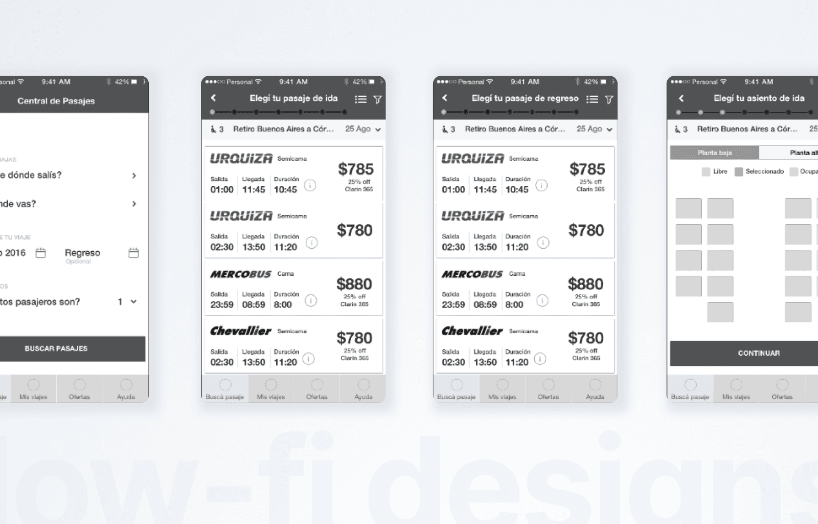
Following brand guidelines, I used San Francisco for iOS and Roboto for Android. Wireframes were first designed in black and white to validate structure and flow before applying color and final design elements.
Collaborative Design Effort
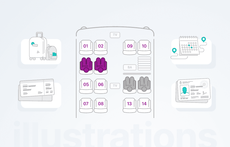
To enhance the visual experience, I worked with a graphic designer to create custom illustrations for onboarding screens and the seat map, adding decorative elements that improved the visual appeal and user engagement. We shared ideas and iterated quickly to align visuals with the app’s aesthetic and functional needs.
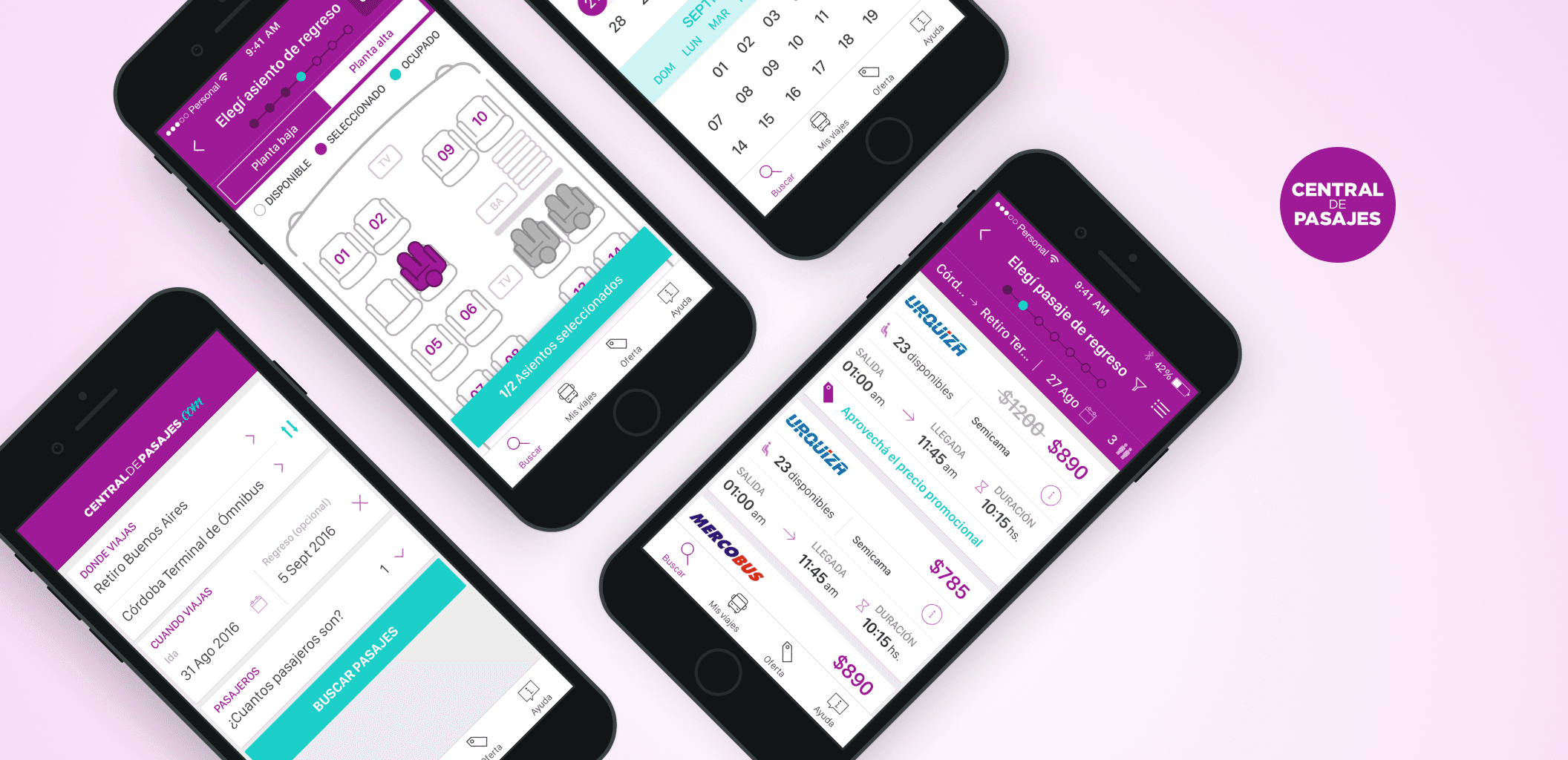
Project Highlights & User Feedback
Clear and simple input for origin, destination, and date.
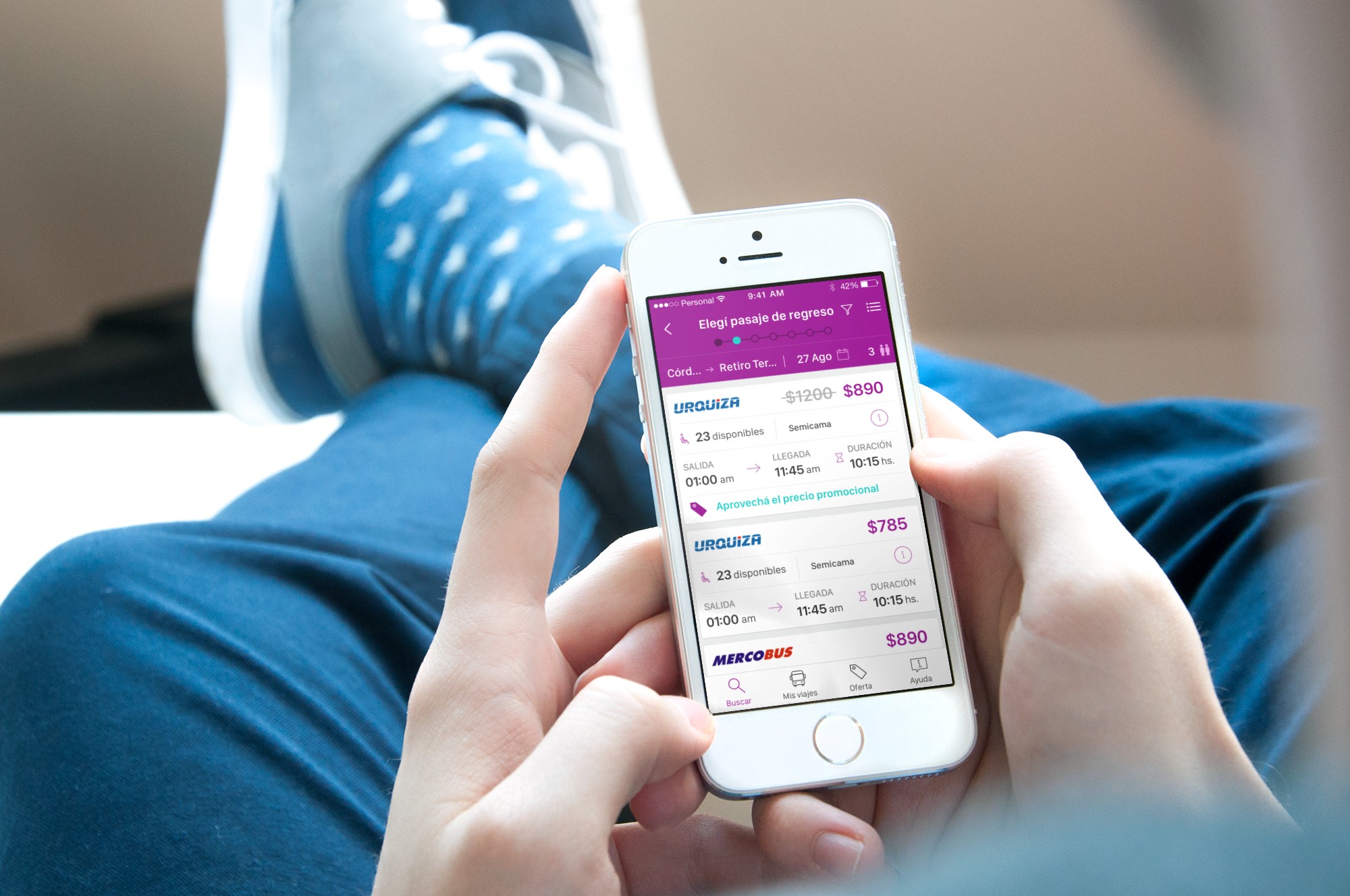
Optimized search results with highlighted prices.
Improved seat selection with better visualization.
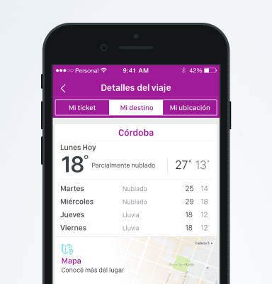
Ticket detail screens with clear route, price, and schedule information.
Onboarding screens to guide first-time users effectively.
User feedback indicated:
High brand recall after the "5 seconds test".
Smooth navigation and easy-to-understand flows.
Users appreciated the visual clarity and simplicity, noting it was easy to use "on the go".
Outcome
The app launched successfully, simplifying the bus ticket booking experience for thousands of users. Working closely with developers ensured that design decisions translated seamlessly into a smooth, user-friendly app.
Reflections & Learnings
Clarity Over Complexity:
The "5 seconds test" confirmed that clear, simple designs with well-defined actions improve user understanding and brand recall.Platform Consistency Matters:
Using San Francisco for iOS and Roboto for Android not only respected each platform's guidelines but also contributed to a familiar and seamless experience for users.Benchmarking as a Shortcut:
Analyzing how competitors like Despegar and Aerolíneas Argentinas structured their ticket booking flows accelerated our understanding of best practices.Communication with Developers is Key:
Close collaboration with the mobile development consultants was crucial, as they were the direct link to the client. Maintaining clear, precise communication and asking the right questions helped keep the process smooth and aligned with client expectations.Informal Testing Works:
Even without direct access to the client or formal research, conducting tests with personal contacts can provide valuable insights and help validate flows and design decisions.