Afluenta
A mobile experience for a collaborative fintech

The challenge
Afluenta is a collaborative finance platform pioneering in Latin America, directly connecting people who want to invest with those in need of a loan—cutting out traditional intermediaries like banks. Operating in Argentina, Mexico, and Peru, the company has issued over 48,000 loans totaling more than 95 million USD.
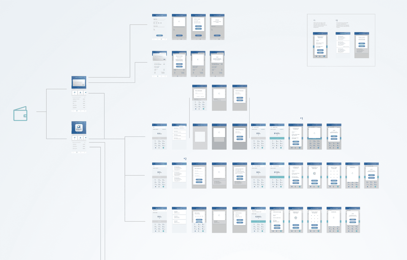
The challenge was to completely design the iOS mobile app from scratch, as Afluenta didn’t have an existing app. The goal was to provide a smooth and trustworthy mobile experience for users to invest, transfer money, and manage their financial activity.
My role
I was hired as a freelance Product Designer through Wolox, a digital agency based in Buenos Aires. While the UX and research phases were already handled by the internal team, my responsibilities included:
Designing all screens for the iOS application
Defining visual patterns to ensure consistency across all flows
Collaborating with a graphic designer to create custom illustrations (e.g. onboarding icons)
Developing a scalable interface aligned with Afluenta’s brand identity
Project goal
To create a clean, intuitive, and consistent UI that would enable users to easily perform key actions like checking their latest transfers, managing their wallet, and linking or removing credit cards—while maintaining visual harmony and brand consistency throughout the app.
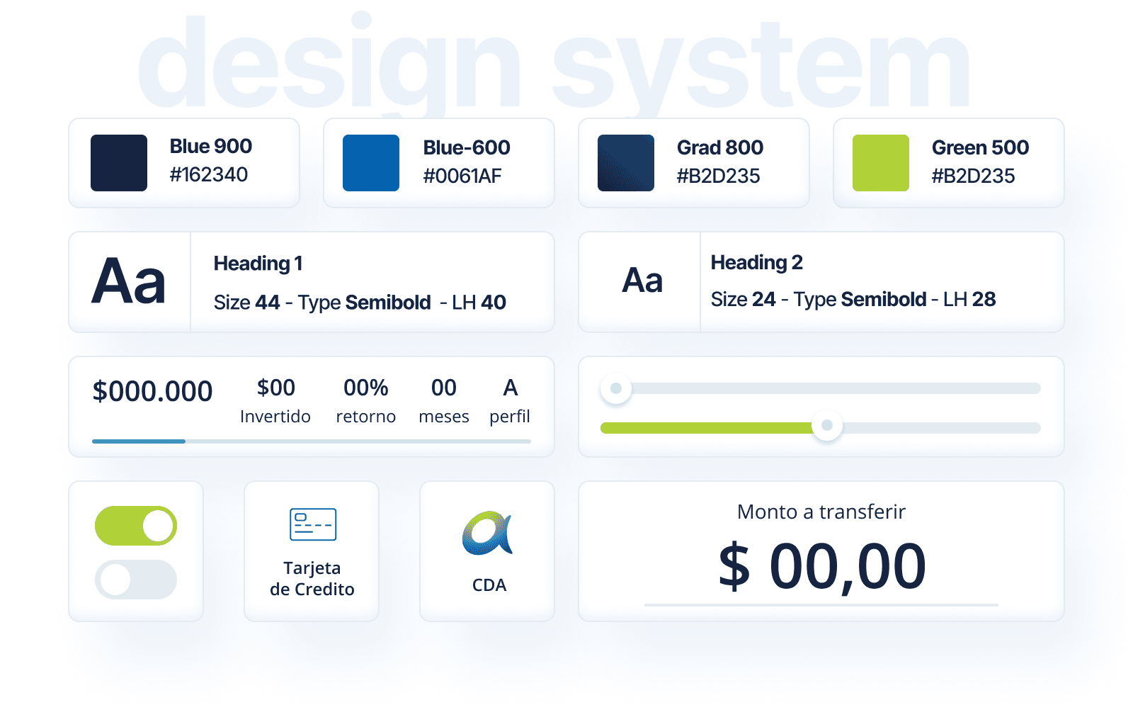
Design highlights
Financial self-management in your pocket
The app empowers users to fully manage their finances in an intuitive way. From checking recent activity to making transfers or removing cards, each screen was designed for clarity, speed, and a sense of security.
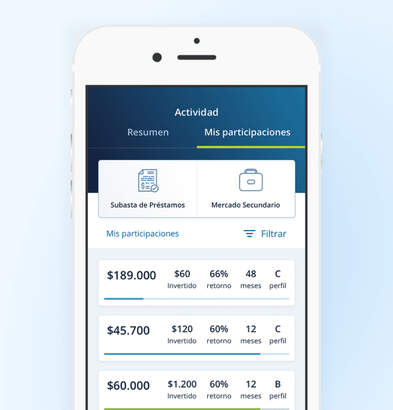
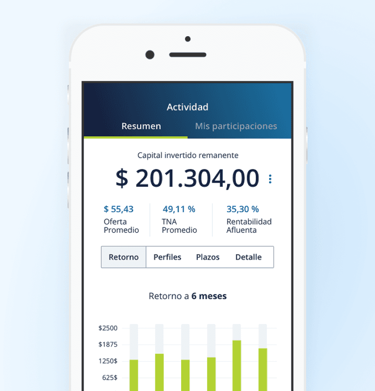
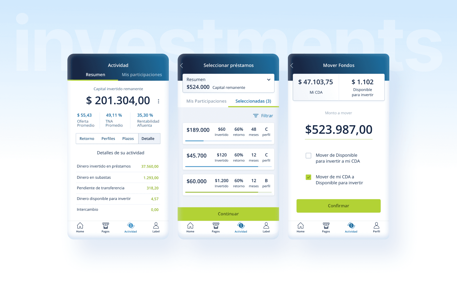
View passive income and recent movements
One of Afluenta’s core values is enabling investors to generate passive income by directly financing loans. That’s why we designed a transaction section that displays income, expenses, and associated payments in a friendly and trustworthy manner.
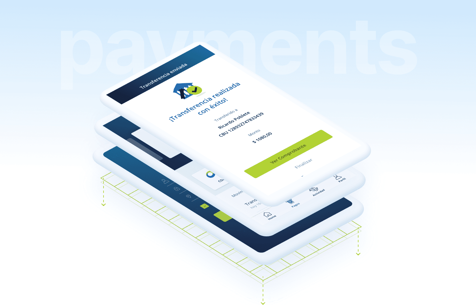
Secure flows for card management
Adding and removing credit cards had to feel secure and frictionless. I focused especially on confirmation states, intermediary screens, and visual feedback to ensure every step felt meaningful and reinforced a sense of user control.
Experience rooted in trust and transparency
As a collaborative fintech, Afluenta emphasizes transparency. From recipient details to transaction overviews, every screen reflects that philosophy—clear information, strong visual hierarchy, and no surprises.
Reflections & Learnings
Working only on UI required me to dig deeper into the product context to ensure clarity and coherence across screens.
Asking the right questions and maintaining direct contact with the client helped me understand the business logic and platform complexity.
We didn’t receive formal user research, so I led internal testing sessions with Wolox colleagues to validate key flows.
Keeping the team informed and collaborating closely was essential to move forward smoothly and unblock decisions.
Maintaining a strong design system from day one became our foundation for scalability and reliable development.